The Absence of Colour: The Right Time for Monochrome
If you have followed my photography for some time or recently looked at some of my work included here on this site or Instagram, you may have noticed that I am primarily a photographer who prefers colour in my photographs. I think colour is one of the most significant characteristics of my images. Some photographers choose to present only in black-and-white, and the representation of black-and-white is varied. Some are low contrast; some are high. A monochrome image is not simply removing colour but knowing how the remaining contrasts work together. Does it benefit the image or take away from its impact?
Why Black-and-White?
Colour can be a defining feature of any image, but removing colour can also change how people approach and appreciate an image. Colour is a beautiful addition to many photos, as its vibrance and saturation can create an impactful image. Yet, there are times when colour distracts more than it enhances. For example, colour may not be essential to the image’s intent when focusing on textures and patterns. This is why experimenting with colour versus monochrome is valuable; sometimes, a side-by-side comparison is essential to understand what version works best for you. Tools like Lightroom make this process easy as you can easily create a virtual copy of an image and use Reference View feature to compare and edit both versions.
Flat Light
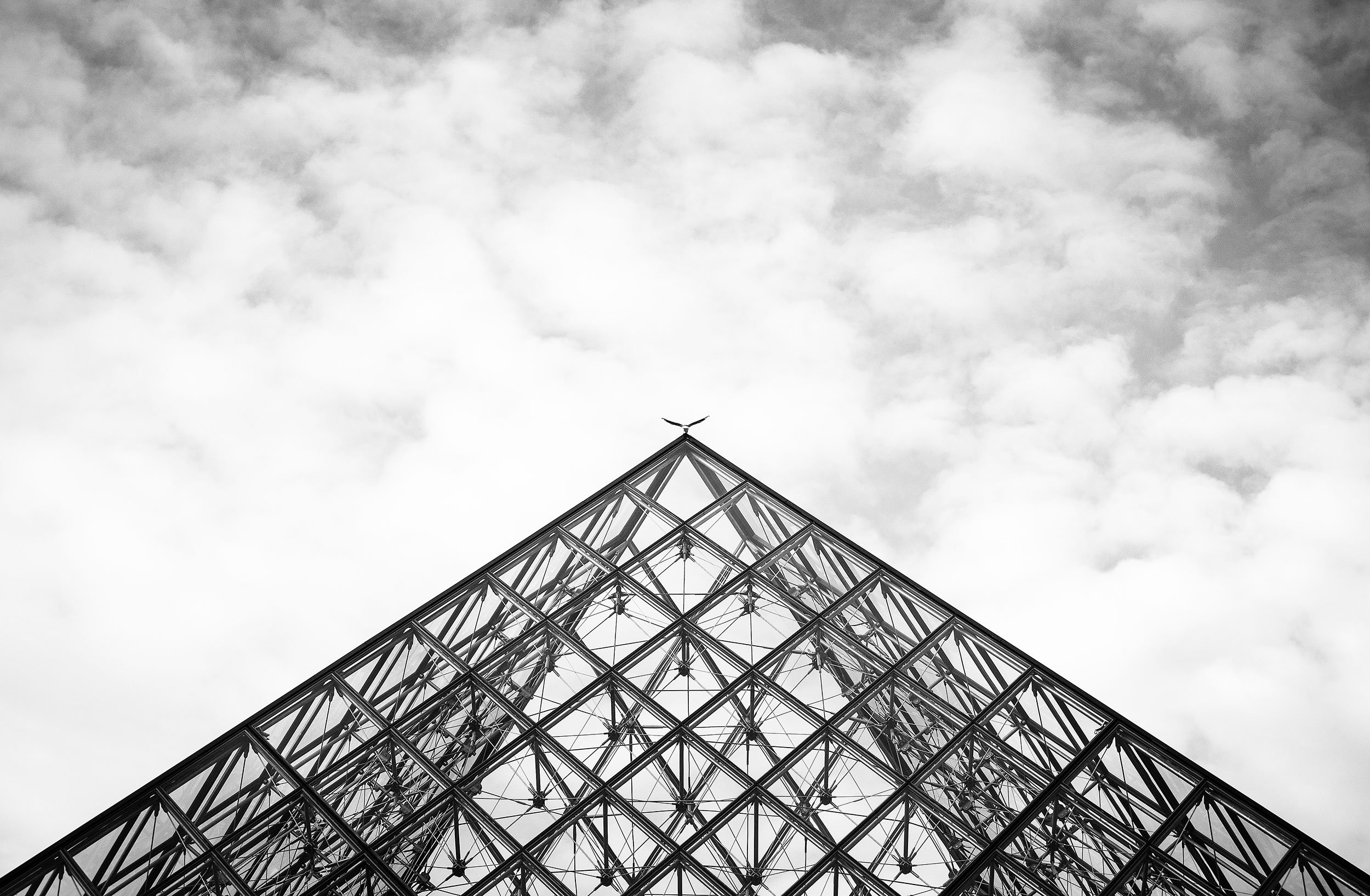
Sometimes, flat light can benefit a photo, but it can also result in dreary and uninteresting pictures from the light’s low contrast. Converting an image to black and white can inject new life into the picture, shifting focus from what doesn’t work to the elements that truly matter, changing the representation. One common reason to consider a monochrome image is to create a specific mood, as monochrome photography can evoke feelings of nostalgia, simplicity, and elegance. It often brings a timeless quality to images, allowing viewers to concentrate on shapes and patterns without the distraction of colour. The historical aspect of black and white can create a sense of sophistication, especially when the subject relates to themes of history or timelessness, for example.
Simplify Composition
When a scene is cluttered with too many colours or subjects, converting to monochrome can simplify the composition, focusing the viewer’s attention on the essential shapes and forms. Strong contrasts in light and shadow can be more striking in black and white, enhancing the visual impact of the photograph. If the subject is of greater importance than the background, monochrome can direct attention precisely where needed.
Conclusion
Ultimately, not everything works as a black-and-white photo, and what works for my photography is the selective use of monochrome throughout my work. I appreciate how black-and-white can create a cohesive body of work, lend itself well to storytelling, and provide a timeless quality. The absence of colour invites viewers to engage with a deeper narrative.